Most Americans who pay attention to what they eat have a routine with nutrition labels. Flip the package, scan the calories, maybe check the sugar, put it back or put it in the cart. It feels like due diligence. It feels like being informed.
The assumption built into that routine is that the numbers on the panel represent a reasonable approximation of what you'd actually consume. A serving of chips is a serving of chips. A serving of ice cream is a serving of ice cream.
It's a reasonable assumption. It's also frequently wrong — and the way it's wrong was, for decades, not entirely accidental.
Where Serving Sizes Actually Come From
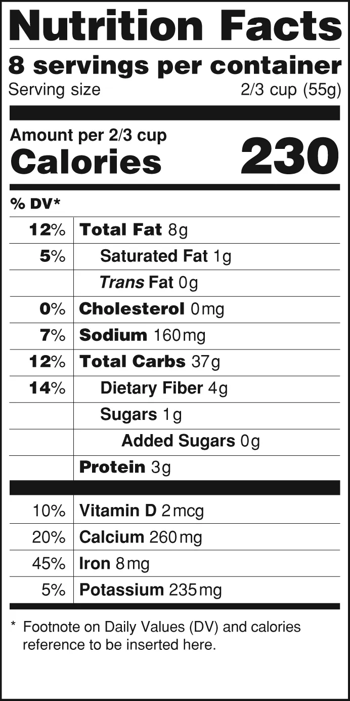
The modern nutrition facts panel was introduced in 1994, following the Nutrition Labeling and Education Act of 1990. It was a genuine public health effort, designed to give consumers standardized information to make better choices. The FDA set reference amounts for different food categories, and manufacturers were required to use those as the basis for their serving sizes.
Here's where it gets complicated: those reference amounts were based on survey data about how much of a given food people typically ate — but the surveys were old, the methodology was imperfect, and the food industry had significant input into how the standards were written. The result was a system where serving sizes often bore a strained relationship to what anyone actually put on their plate.
A classic example: for years, the serving size for a standard 20-ounce soda bottle was listed as 8 ounces, meaning the label showed roughly two and a half servings per container. Nobody drinks two-thirds of a bottle of Coke and puts the rest in the fridge. But the label let the calorie count look like 100 instead of 250, which was considerably better for business.
Similar math applied to chips, cookies, cereals, and dozens of other packaged foods. The serving size wasn't describing a portion. It was performing one.
The 2016 Update — and What It Didn't Fix
The FDA finalized updated nutrition label rules in 2016, and most large manufacturers were required to comply by 2020. The update was meaningful. The 20-ounce soda bottle now lists a single serving, because the FDA acknowledged that a container people typically consume in one sitting should be labeled as one serving. Calorie counts got larger, bolder type. Added sugars got their own line.
These were real improvements. But the update didn't solve the underlying problem — it just redrew the edges of it.
For foods that come in larger containers meant for multiple uses, manufacturers still have latitude to set serving sizes that may or may not reflect how the product gets used. A bag of trail mix, a box of pasta, a jar of peanut butter — these aren't single-serving containers, so the old logic still applies. The serving size is calibrated to the reference amount, which is calibrated to survey data, which may or may not resemble the portion you're about to eat.
A serving of peanut butter is two tablespoons. That sounds reasonable until you watch someone actually make a sandwich. A serving of breakfast cereal is typically three-quarters of a cup. Pour yourself a bowl and then measure what's in it.
The Multiplier You're Almost Never Doing
The practical problem is arithmetic. To get from the nutrition label to what you actually consumed, you have to know the serving size, estimate how much you ate, calculate the ratio, and multiply every number on the panel by that ratio.
Almost no one does this. It's not because people are careless — it's because the label wasn't designed to make that calculation easy or intuitive. It was designed to display a number that looked acceptable when you glanced at it in a store aisle.
This is why nutritional research consistently finds gaps between what people believe they're consuming and what they're actually consuming. It's not purely a matter of willpower or attention. The information architecture of the label itself creates friction.
The Dual-Column Label — A Partial Solution
For certain products — those that could be consumed in one sitting or multiple sittings — the 2016 update introduced a dual-column label showing both per-serving and per-container nutrition information. A can of soup that's technically two servings now has to show you what the whole can contains, right next to the per-serving figures.
This is useful. It's also applied narrowly. Not every multi-serving product gets the dual column, and consumers still have to know to look for it and understand what they're comparing.
The dual-column label is the FDA acknowledging, quietly, that the single-serving format was misleading people. It's a fix for part of the problem that implicitly confirms the problem existed.
What to Actually Do With This Information
None of this means nutrition labels are useless. They're still the best standardized information you have, and comparing labels across similar products is genuinely valuable — the serving size inconsistencies are somewhat controlled for when you're comparing apples to apples within a category.
But reading a label as though the serving size is a neutral, scientifically derived description of a normal portion will lead you astray. It isn't. It's a regulatory construct that was built with significant industry input and has been updated imperfectly.
The most useful habit is simple: before reading any number on the label, look at the serving size first and decide whether it's actually the amount you're going to eat. If it isn't, the rest of the numbers need adjustment before they mean anything.
That one shift changes the whole panel. And it's the shift the label was never quite designed to make obvious.