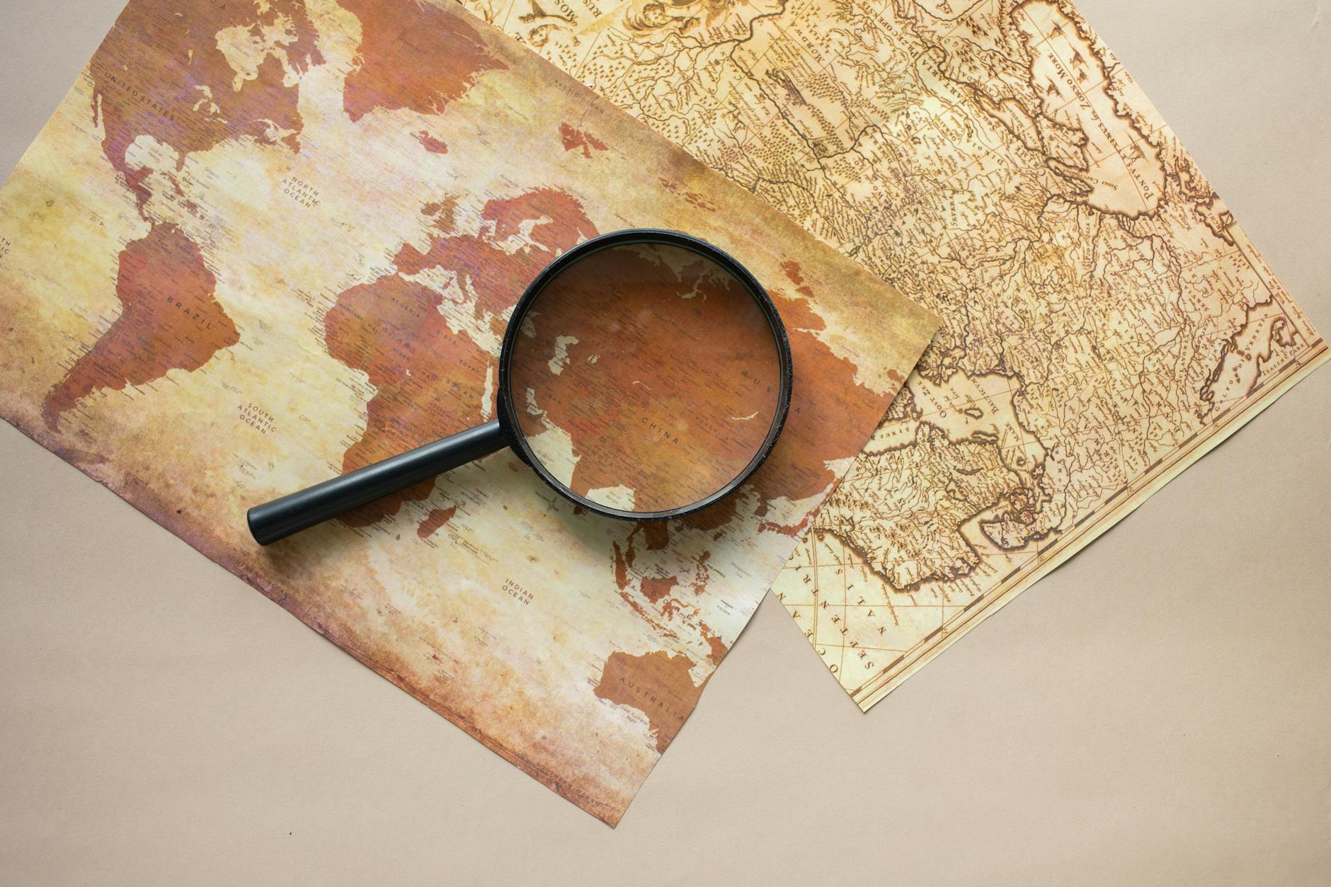
The Map Everyone Knows
Close your eyes and picture the world. Chances are you're seeing something that looks like the map in every classroom, airport, and news broadcast: Europe and North America dominating the center, Africa looking roughly the same size as Greenland, and Antarctica stretched across the bottom like a white continent-sized pancake.
This mental map feels natural because it's everywhere. Google Maps defaults to it. Weather services use it. It's printed on everything from coffee mugs to classroom posters. But this familiar image of Earth is fundamentally wrong about the relative size of continents.
The Numbers That Don't Add Up
On the standard world map, Greenland appears to be about 80% the size of Africa. In reality, Africa is 11.6 million square miles while Greenland is 836,000 square miles. You could fit Greenland into Africa fourteen times with room left over.
The distortions get more dramatic the farther you move from the equator. Alaska looks massive compared to Mexico, but Mexico is actually larger. Russia appears to dominate the world, stretching across nearly half the map, but it's actually smaller than Africa.
These aren't small errors or approximations — they're systematic distortions that fundamentally misrepresent the planet's geography.
How Sailor Instructions Became World Geography
The map everyone knows is called the Mercator projection, created in 1569 by Flemish cartographer Gerardus Mercator. But Mercator didn't design it to show the world accurately — he designed it to help sailors navigate.
 Photo: Gerardus Mercator, via i.pinimg.com
The Mercator projection has one crucial advantage for navigation: straight lines on the map represent constant compass bearings on Earth. A ship captain could draw a straight line from Portugal to Brazil, measure the angle, and sail in that direction without constantly recalculating their course.
This was revolutionary for 16th-century navigation, but it came with a trade-off. To maintain those straight navigation lines, the projection had to stretch land masses increasingly as they moved away from the equator. Mercator knew this and didn't care — accuracy wasn't the point, usefulness for sailors was.
When Navigation Became Education
The Mercator projection dominated marine charts for centuries, which made sense. But sometime in the 20th century, it jumped from ships to schools. Publishers began using it for wall maps, atlases, and educational materials, despite its built-in distortions.
Why did educators choose a navigation tool for geography lessons? Partly because it was familiar and widely available. Map publishers already had Mercator plates and printing processes. It was easier to repurpose existing sailing charts than create new educational maps.
The projection also had practical advantages for classroom use. Its rectangular shape fit standard wall spaces and book pages better than more accurate projections. Teachers could point to locations easily, and students could find countries without dealing with curved grid lines or unusual shapes.
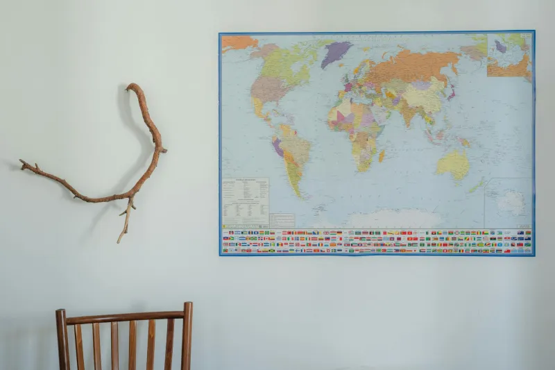
The Mental Map Problem
Once the Mercator projection became the default classroom map, it shaped how entire generations visualized the world. Students learned geography from distorted images and carried those proportions into adulthood.
This mental map affects more than trivia knowledge. It influences how people think about global politics, economics, and cultural relationships. When Africa looks small on maps, it's easier to think of it as less important or influential than it actually is.
Development organizations have noted that distorted maps contribute to misconceptions about Africa's size, diversity, and economic potential. Investors and policymakers who grew up with Mercator projections sometimes struggle to grasp the continent's actual scale and complexity.
Why Change Is So Hard
Geographers have developed dozens of more accurate world map projections. The Peters projection preserves area relationships. The Robinson projection balances multiple factors for general use. The AuthaGraph projection minimizes distortion across the entire surface.
But changing the standard map turns out to be surprisingly difficult, even when people are shown the alternatives. The Mercator projection is embedded in everything from navigation systems to corporate logos. Switching requires coordinated changes across industries and institutions.
There's also psychological resistance. People become attached to familiar images of the world. When shown accurate maps, many viewers initially think they look "wrong" because they don't match the mental map everyone learned in school.
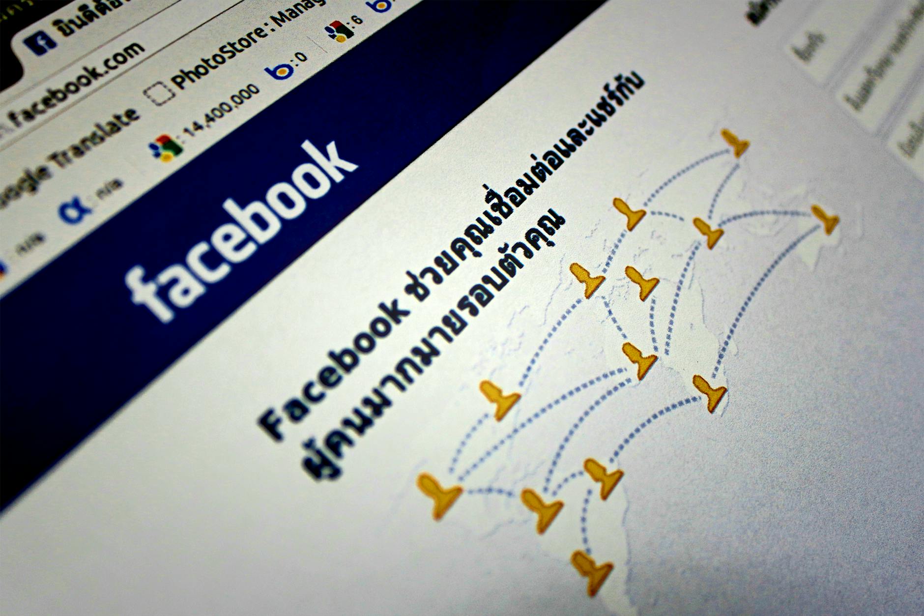
The Digital Age Makes It Worse
You might expect digital mapping to solve the problem, but it's actually made things worse. Google Maps, Apple Maps, and most web mapping services use Web Mercator, a digital variant of the original projection.
They chose Mercator partly for technical reasons — its rectangular grid works well with computer graphics — and partly because it matched user expectations. When Google tried alternative projections in early versions, users complained that the world looked "weird."
So the same 500-year-old sailing instructions now shape how billions of people navigate digitally, from finding restaurants to planning international travel.
What Accurate Maps Reveal
When you see the world drawn with accurate proportions, the differences are startling. Africa dominates the map, revealing its actual status as the second-largest continent. South America looks massive compared to North America. Europe appears as what it actually is — a relatively small peninsula attached to Asia.
These accurate proportions help explain global demographics, economics, and politics in ways the familiar map obscures. Africa's size correlates with its population (1.4 billion people) and its growing economic influence. Europe's actual size helps explain why it developed as a collection of small, competing nations rather than continental empires.
The Takeaway
The world map in your head was designed by a 16th-century cartographer to help sailors maintain compass bearings across oceans. It was never intended to show the relative size of continents accurately, and it doesn't.
This navigation tool became the default way to visualize Earth through a series of practical choices by publishers, educators, and digital designers. Each decision made sense individually, but collectively they've given most people a fundamentally distorted mental image of the planet.
Geographers have known about these distortions for decades and developed better alternatives, but changing a mental map that's embedded in everything from classroom walls to smartphone apps turns out to be one of the hardest problems in cartography. Sometimes the most familiar image is the least accurate one.